


21 Feb Manuel Mérida – Cinquiéme Couleur
Artist
Manuel Mérida
Text
Hervé Mikaeloff, Valentina Locatelli and Lourdes Blanco
Direction of graphic production
Cinquième Couleur
Edition
Espace Meyer Zafra
Printing and binding
Nexe Impressions / Artmoon
Nathalie Guiot, director of the Cinquième Couleur print shop in Paris, with whom we have the pleasure of collaborating on different projects related to the art world, proposed that we work on this challenge by the artist Manuel Mérida, as part of an exhibition organised by the Espace Meyer Zafra in Paris.
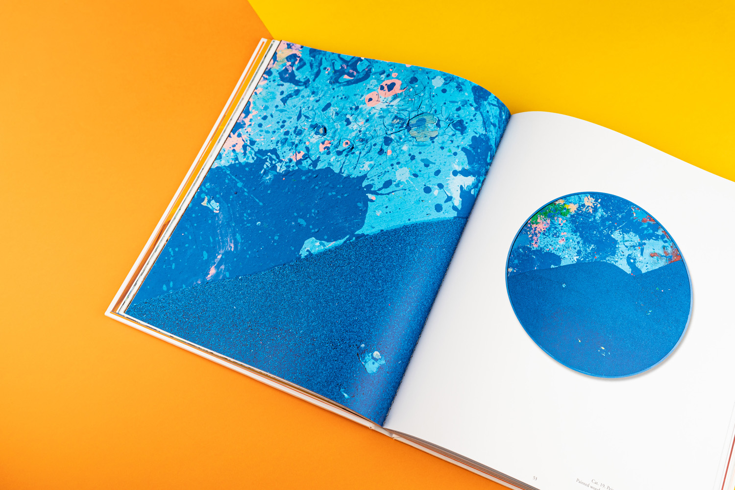
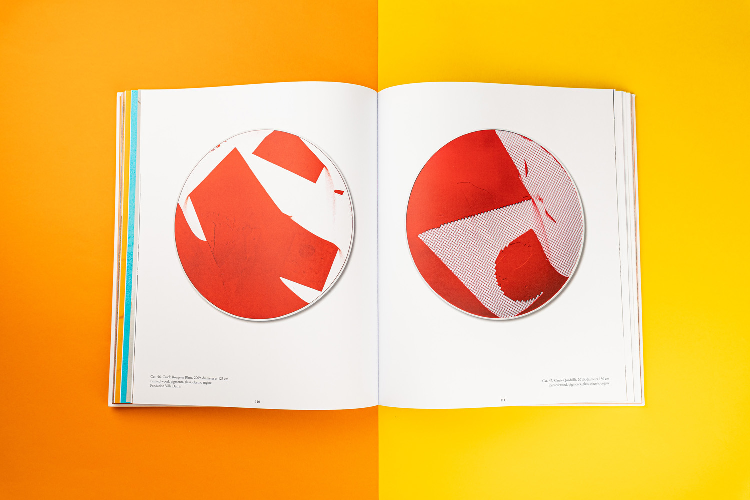
Manuel Mérida, a renowned French-Venezuelan artist, likes to experiment with organic materials in his works, and from a philosophical point of view, his inspiration is motivated by the succession of constructions and deconstructions that time gives us. In this sense, his reference is inscribed in the vision of Heraclitus, the Greek philosopher of the 6th century BC, who compared the perpetual changes to which life subjects us to the constant fluidity of a river.
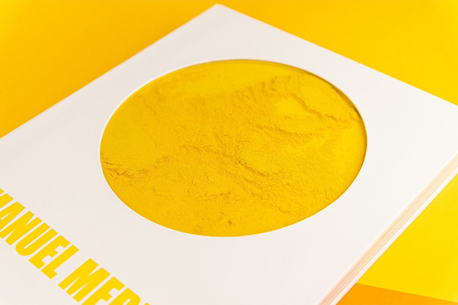
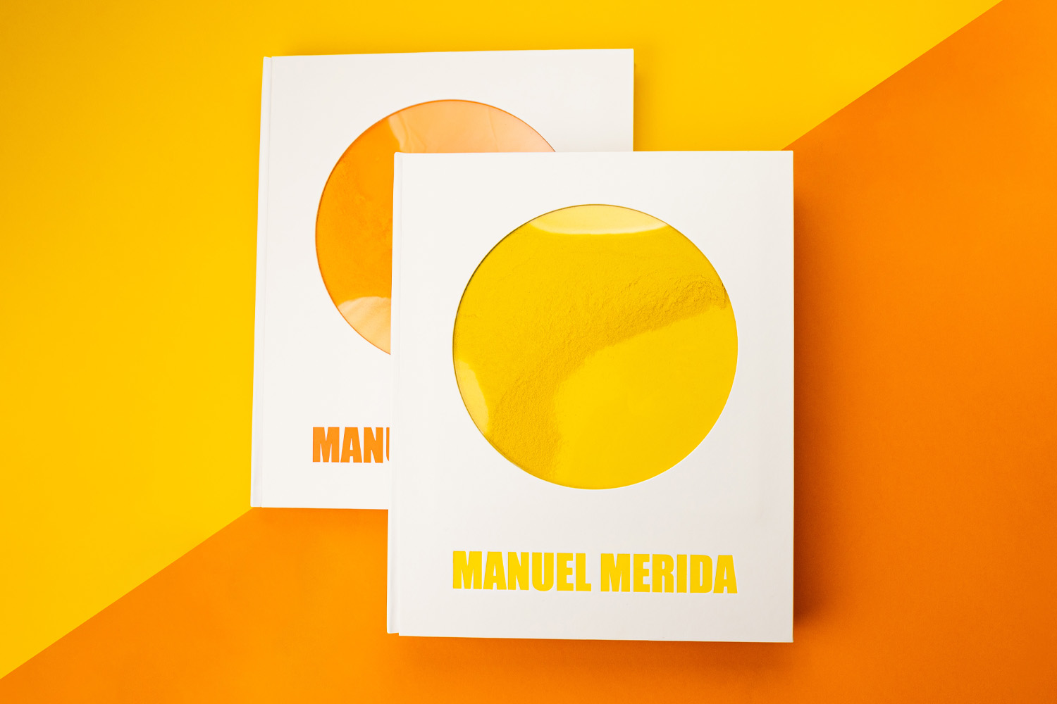
The uniqueness of this project is to be found in the book cover. The artist has worked with coloured pigments in a specific and concrete dose, and this pigment was to be deposited on the cover as a kind of fluid, as a kind of “vision from the fishbowl“. Moreover, the quantity had to be the same for each copy. Here we had to resort to R&D in order to obtain the result the artist wanted. In this sense, the coordinated teamwork of the Nexe Impressions technical office and the Artmoon workshop in Quart (Gironès) achieved the objective.
The result is explained in the images, the video and the technical sheet that accompanies this post. A challenge in which we have suffered and enjoyed in equal parts, but as always when the result is successful, it has been worth it.
We always enjoy exploring the limits of our craft, trying to go beyond the conventional, to produce unique and original pieces and thus help our clients and collaborators to achieve the objectives of such special projects.
TECHNICAL SPECIFICATIONS
Pagination
Book 180 pages + flyleaves + cover with overlays
Format
280 x 340 mm
Printing
Inside: HP INDIGO 4/4 inks on 170 gsm extra FSC top offset
Cover: Printed in one colour, with 20 cm diameter die-cutting
Paper
Inside: 170 gsm extra FSC top offset.
Flyleaves: 140g Popago Intense Offset (yellow, orange and blue with matching pigments)
Cover with 6 layers:

Making of the cover
First of all, layers 2 and 4 were die-cut. Then, the 1st guard (layer 5) was glued onto the 2nd die-cut cardboard (layer 4), so that this would serve as a container for the pigment that the artist had sent us in single doses for each book. Once the pigment was poured into these layers, the plexiglass (layer 3) was placed and layer 2 was glued on top of it. After that, the lining (layer 1) was glued and the hot stamping with KURZ COLORIT in yellow, orange and blue, matching the pigments and flyleaves, was carried out. The resulting piece was then glued onto the last layer (6), previously die-cut, which serves as the book’s flyleaf.
Binding
2.5 mm printed hardcover with ivory white cardboard without cups and flat spine.
Finishes
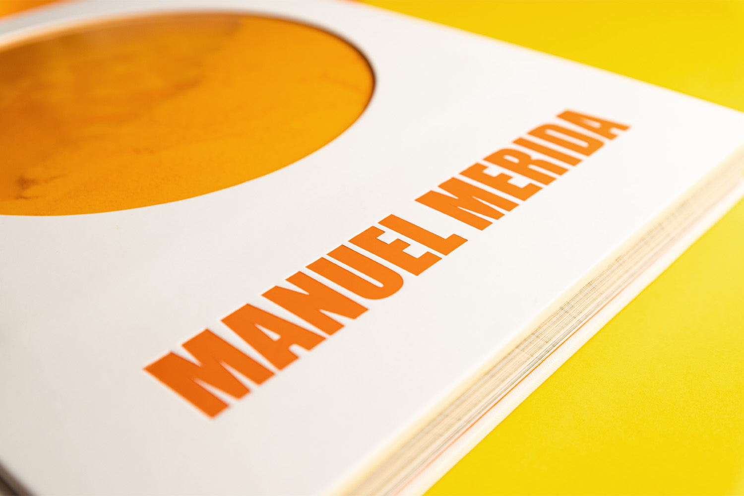
Hot stamping on the cover with the artist’s name (3 different colours).
Pigment handling: the pigment supplied by the artist is applied in individual doses directly onto the cut-out circle.
Packaging
Individual boxes in recycled microflute cardboard made to measure and personalised with the same colours as the pigments.
No Comments