01 Feb Éditions Cercle d’Art – Fondation Picasso Paris
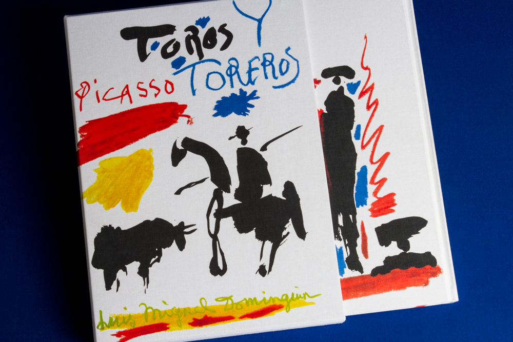
Book: PICASSO, Toros y Toreros
Introduction
With this project we took up a technological challenge. Our partners on our path to success were the Les Caméléons and Nexe-Agpograf photo-engraving and printing companies.
When Bernard Champeau, project manager at Éditons du Cercle d’Art, showed us the project, we could never have imagined that the results would satisfy everyone so quickly.
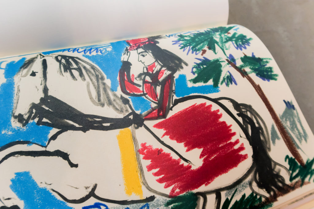
Our remit was to succeed in creating a faithful reproduction of Pablo Picasso’s work “Toros”, based solely on a book printed in the 1960s and nothing else. What is more, after analysing this book, we found that some pages were Pantone quadrichrome + various, some were Pantone bichrome + background and others were Pantone trichrome. They were all in an unstable condition to print from one page to another and with no standardisation.
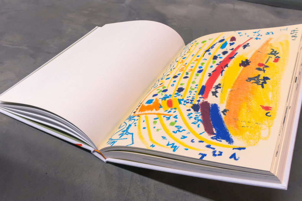
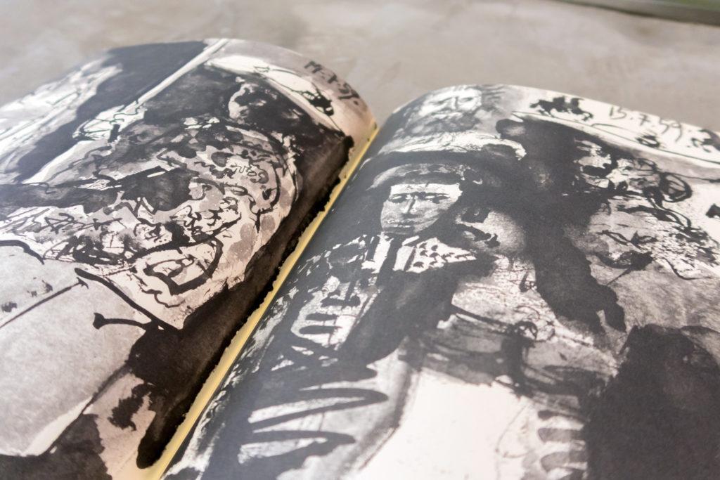
Our objective was to use an industrial process to improve the quality of the work’s reproduction, achieving greater sharpness and improved contrast and colour rendering, as well as providing greater stability from the beginning of the book to the end.
Following analysis by our technical teams, we presented a road map and a technical proposal. Our idea consisted of printing the coloured notebooks using our multichrome printing technology (RGB range), and thereby conserving the different Pantone prints in our original document. For the bichrome and trichrome pages we opted for a Pantone Black and two Pantone beiges of different strengths. To make it even more of a challenge, the chosen paper was Old Mild: a top-end paper with a high degree of porosity.
Photo-engraving process
1) First of all, Les Caméléons, the Parisian photo-engraving workshop, performed a HD scan of the original pages of the book, excluding the frame to prevent any smearing during the subsequent printing.
2) The second step was to remove all impurities from the old book, improving contrast and sharpness and recreating the lost backgrounds.
3) Based on the original, it was necessary to apply the spectrophotometer to the different background shades, in order to validate the paper and image backgrounds, particularly given that these backgrounds differed from one page to the next. We finished off the project by dividing it into 4 types of notebooks:
Notebooks with RGB multichrome pages (all the pages in colour)
Direct black notebooks Pantone Black U
Notebooks in 2 Pantone creams, 1 Pantone grey and 1 Pantone black for the images in black (bichrome)
Notebooks in 2 Pantone creams, 1 Pantone grey and 1 Pantone black for the images in black (trichrome)
4) Contractual proofing:
All the tests were performed with the multichromy-adapted FOGRA 47L profile (RGB range) but also, as a result of the spectrophotometric measurements of the Pantone cream tones and the direct machine tests on the bichromy (black+grey), we were also able to adapt and simulate FOGRA 47L profiles for these direct shades. The customer was therefore able to validate the contractual proofing before the printing.
Data sheet
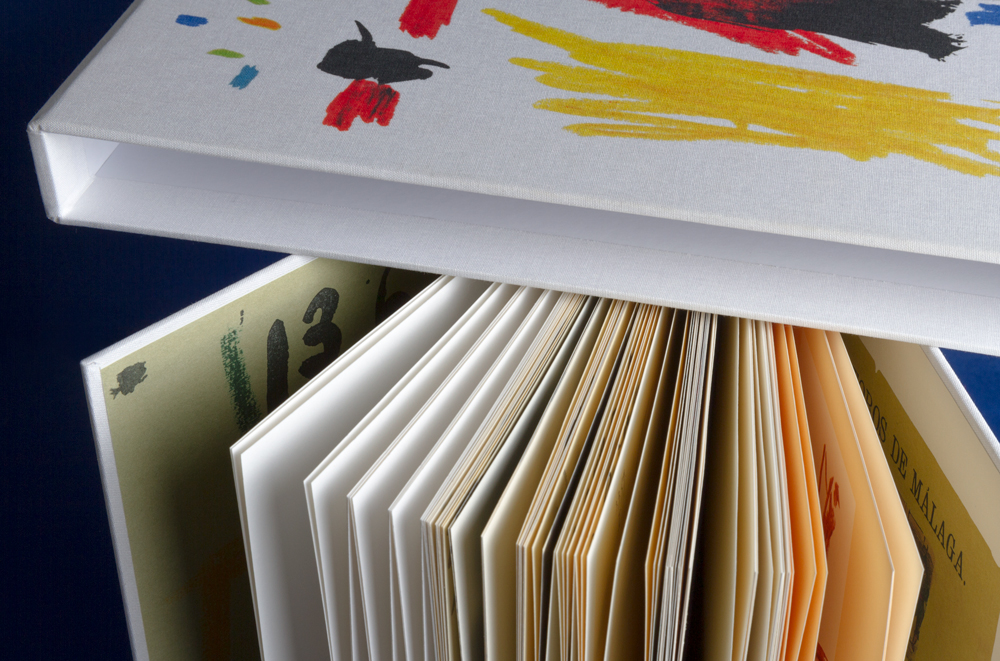
Book + Presentation Box
Size: 27.8 cm x 37.8 cm.
Pages: 172 using Fedrigoni 190g Old Mill Premium White paper
Covers: also 190g Old Mill Premium White.
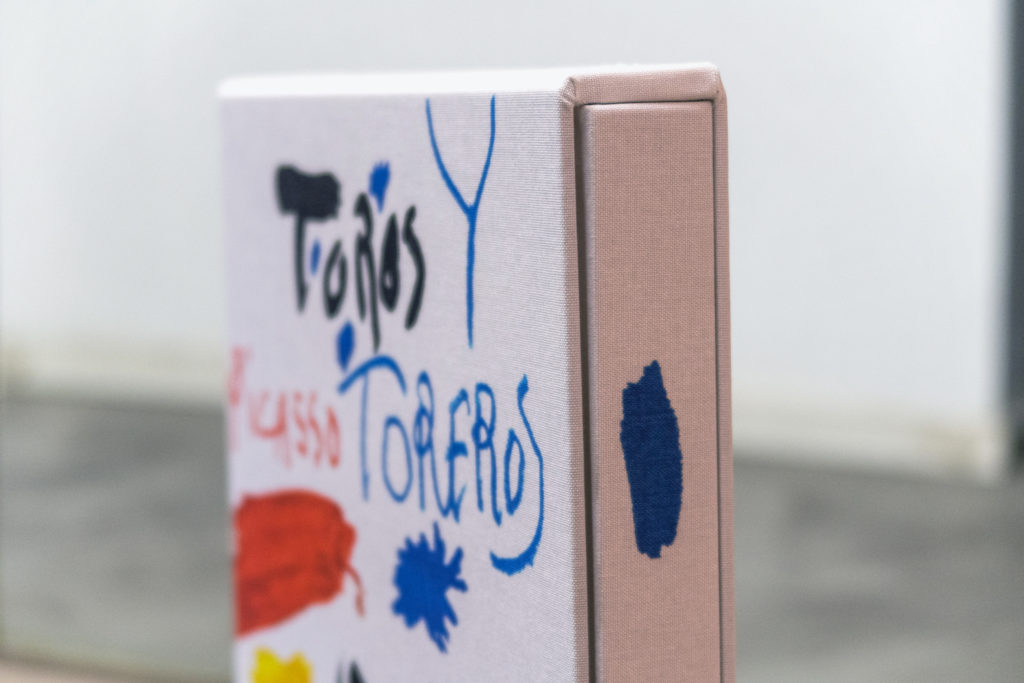
Cover and presentation box sleeve: Brillantia Winter white canvas
Binding: saddle stitching, 3.5 mm cardboard with endbands and a flat back.
Presentation Box: 3.5 cm cardboard with white canvas and interior.
Notebook printing:
44 pages in 7-colour RGB multichrome.
32 pages in 1-colour Pantone black U.
80 pages in 4 Pantone colours: 2 creams, one Pantone black U and one Pantone grey.
The rest in 3 Pantone colours: 1 cream, one Pantone black U and one Pantone grey.
Print run: 6,000 copies (2,000 in French + 4,000 in English)





No Comments