Multicolor-RGB printing
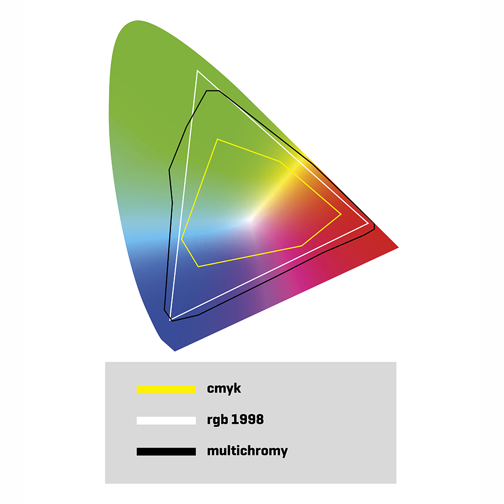
Multicolor printing technology or RGB simulation profiles in printing, is a technique which extends the innovative CMYK colour space significantly, adding three more colours to the traditional cyan-magenta-yellow-black printing method. The result is a colour reproduction with seven inks which provide an optimised combination by applying the ADOBE RGB 1998 profile to the images and communicating this to a specific software which makes the conversion.
The results obtained provide a high print quality and pristine definition, thanks to the expansion of the colour spectrum provided by the RGB light profile, until now never simulated in colour reproduction, in an opaque medium (paper) and the application of stochastic patterns of 20 μm on coated papers and 30 μm on offset paper. The finished results are really sharp images, with depth and high contrast, and a multiplied colour spectrum and extraordinary accuracy in relation to the original image.
With multicolor technique it’s possible to achieve:
• extreme accuracy in relation to the original
• razor sharp images
• excellent depth
• inimitable contrast
• unbeatable definition
• wide spectrum of colours for your oranges, reds, blues, and greens and intense colours

Faq’s
1. What is MULTICOLOR?
Multicolor is an offset printing technique developed by Agpograf, which uses RGB to RGB instead of the conventional CMYK. The prints are made using 7 colours, and with the result of brighter, sharper, deeper, more accurate prints with higher contrasts, thanks to a huge increase in the range of colour that can be reproduced.
2. What should MULTICOLOR be use for?
Whenever you want high quality, incredibly accurate colour prints, from a colour range that CMYK cannot match, including oranges, reds, greens, purples and blues (see the colour chart in the catalogue for the full range), or when you want to produce COLOUR CHARTS AND PRODUCT SAMPLES.
3. Do I need to touch up the image in any way beforhand?
Not at all. Our only recommendation is that you provide us with images that are as high quality as possible, and make sure the images you want to print in Multicolor are in the Adobe RGB1998 colour profile.
4. What format should I submit the files I want to print in Multicolor?
Save the images in the Adobe RGB 1998 colour profile, and save as PDF-X4 instead of the traditional PDF-X1.
5. How do I know if an image would be better if printed using Multicolor or CMYK?
Open Photoshop, and with the Adobe RGB 1998 colour profile applied, go to VIEW-INFO PALETTE. You will then be able to see the colours that cannot be reproduced using CMYK, but which can be reproduced using Multicolor, as they will appear in grey.
6. What level pf accuracy do the colour proofs have in comparison to CMYK ISO 12647/7?
The colour proofs in CMYK ISO 12647/7 are a good base to see the final result you will get in print form. Colour proofs for Multicholor produced by Agpograf are also a good base to see the final result of Multicolor when printed.
7. Et is true that the MULTICOLOR can reproduce almost the entire Pantone range? How do you do it?
Unfortunately there is no colour palette available that includes the entire colour spectrum for Pantone, but Multicolor has a very wide colour range, and we can confirm that the vast majority of Pantone colours can be reproduced by Multicolor, except for certain small differences in Delta AE (CIEDE 2000), which are indistinguishable to the human eye.
How do you convert images between Pantone and Multicolor?
We have incorporated all the Pantone colour libraries, and when making a colour conversion the system searches for the Pantone colour specified in Multicolor based on information for the colour spectrum and minimising the visual differences when the image is printed.
In addition to completing the process, a report is created detailing any differences in colours once the image has been printed, and it is possible to see if the result will be what you want before printing.
There are colours that will not work with Multicolor, such as metallic colours (silver, gold, etc.).
Section
8. Multicolor is the ideal technology for making COLOUR CHARTS AND PRODUCT SAMPLES that require a high level of accuracy. Which formats does it use?
It will work with any formats, as the system developed by Agpograf is very versatile in terms of direct colour conversion.
It can import colour tables in different formats, such as: ACO, CXF, CCF, ICC and TXT.
This allows each customer to read the colour range directly, or through a spectrophotometer.
One of the most important aspects is that you can see any colour deviations before printing.
9. Which type of paper is best to use with Multicolor?
There are two types of paper that work well with Multicolor: coated paper (whether glossy, matte or semi-matte), and offset paper (the higher quality the better). The first example gives a much “lighter” finish to the printed product, with higher definition. The second format also gives a “light” finish, which is especially important because, as you know, offset paper absorbs ink and thus the “light” when printed, which corrects this common problem with offset paper.
10. Can you specific colour profiles depending on the type of paper or profiles tailored for each client?
The system allows you to create customised profiles for different types of paper and according to specific requirements. To do this, you must first make carry out a series of tests to create a new colour palette, and to check it works properly.
11. How do you convert the colours from RGB to Multicolor?
The system Nexe Impressions has developed is very versatile, and analyses the colours according to the colour mode (RGB, CMYK, Grayscale or Lab). According to the colour mode chosen, you can choose what you would like to do, for example: convert everything in RGB to Multicolor, while leaving everything in CMYK as it is, or change it in accordance with ISO 12647/2. The same goes for Grayscale or Lab, so we covert the colour according to the specific colour mode.
12. How does the 20-micron stochastic screening affect the final quality of the work?
13. Why are the images so sharp?
One of the reasons the images are so sharp is due to the use of the stochastic screen, but another very important reason is the autofocus system used when converting RGB images to Multicolor.
As Multicolor works with a very broad range of colours, you may need to make certain readjustments to ensure there is no loss of focus during the conversion.
The autofocus system analyses each image by adjusting the focus of the same according to different criteria, such as size, resolution, and so on.
This combination is what creates such a sharp printed result, with perfect focus.
14. Who could benefit from using Multicolor?
Any client who needs or requires extremely high quality in their products, to give some examples: art, jewellery, optics, fashion, painting, photography, ceramics, cosmetics, furniture, colour charts, sample books, etc.
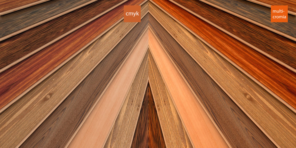
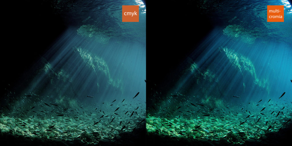
This is the difference


Our Successes
We were asked by the Circo de Bazuka agency in Paris, to produce the DREAMTONE catalogue for Lancôme. This catalogue includes images in CMYK, a pantone silver, and 5 direct pantone colours. Once the document is analysed we then offer to transfer the 5 direct pantone colours and the CMYK images to Multicolor. The result is that all the pantone colours are printed accurately, producing highly defined images showing the skin, lips, and product in pristine detail. Lancôme has assured us that we will continue to work on their most exclusive products, using our Multicolor technology.
We were asked, by the Francesca Avossa and Minsk Studio in Paris, for pristine quality in the definition and fidelity of their traditionally manufactured upholstery materials for a highly demanding luxury market. These upholstery materials are exclusive and made in the Persian tradition. Multicolor was the solution we proposed and once again the customer was extremely satisfied with the result. We are currently working on their samples with real products, in printed format!
On the occasion of the exhibition of its artist Farhdad Moshiri, the gallery commissioned us to print a book presenting a retrospective of his work whose character is both minimalist (images with a lot of detail) and very colorful. (especially strong electric oranges) could not be reproduced in conventional CMYK. After many retouching and adjustments, multicolor, once again, proves to be the solution. Our catalog shows on pages 30-31 a partial image of one of the paintings, which you can judge.


